Strong university, strong design
More freedom, more flexibility – as ETH continues to develop, its corporate design is keeping pace. We are reinvigorating our corporate design to give it a more incisive, modern and attractive look. Even more importantly, we are ensuring consistency and clarity across all channels and conveying a strong message for a strong university with a promising future.
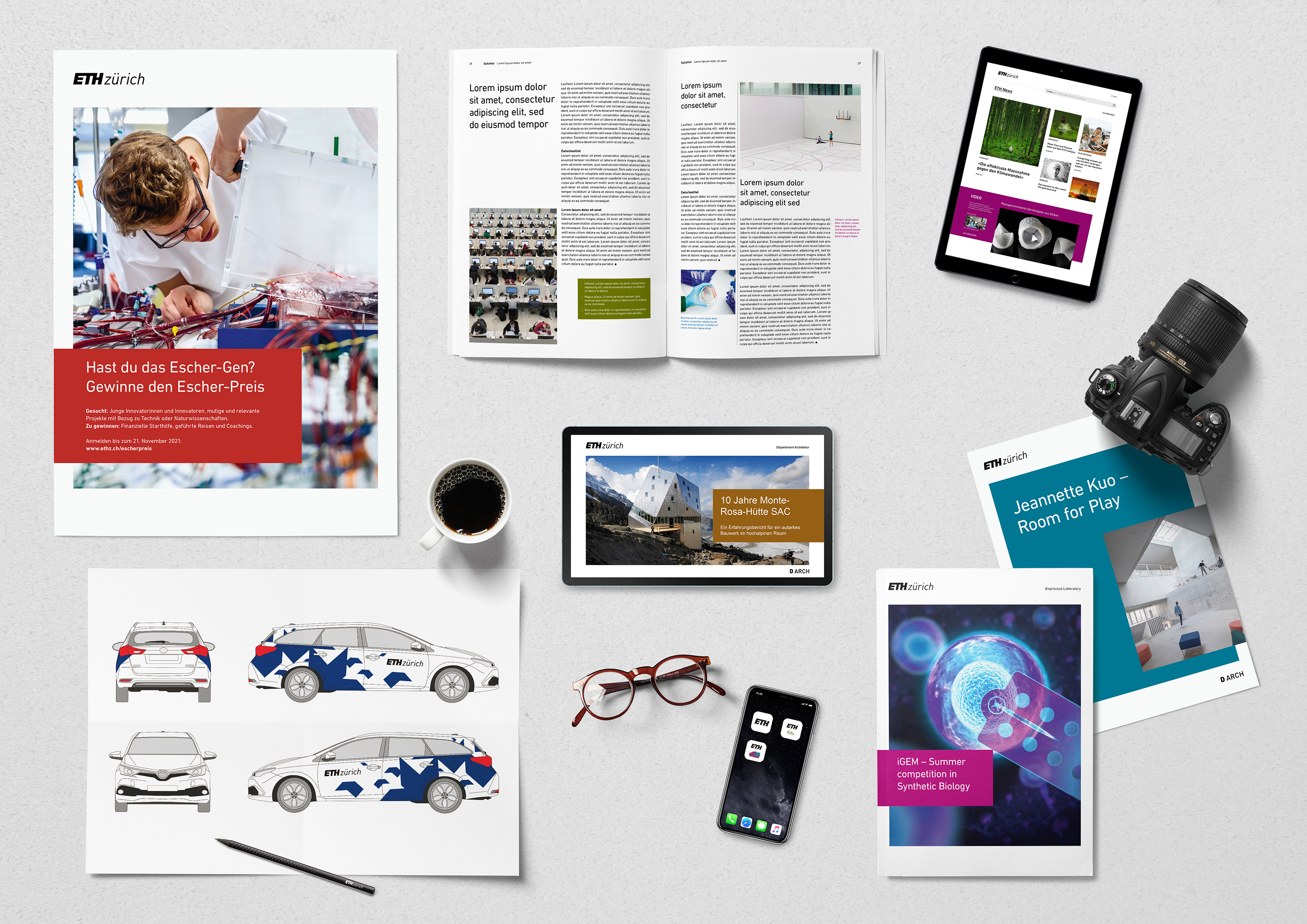
As visual trends change over time, in recent months Corporate Communications has revamped ETH’s look, which has been in place since 2013, for all media. The coronavirus crisis delayed the schedule only slightly, as most of the work had already been done before the lockdown.
New design templates
ETH Zurich’s new look is modern and flexible and can be understood as a refinement of the current design. In future, consistent use of the logo in black and white will further strengthen the “ETH Zurich” brand. A conscious effort was made to ensure that the old and new designs could coexist for a transitional period. Especially given the current situation, it was important to ensure that nobody would be forced to revise existing media immediately. If, however, an update is due or, say, a brochure or poster is being redesigned, then these should follow the new corporate design guidelines that apply from today. For the most important products such as posters, reports or PowerPoint presentations, the new design templates with best practice examples and guidelines are available online. For employees in the central administrative units, the PowerPoint templates will be automatically installed via Baramundi under “personal templates” on Friday morning.
However, these new design templates do not mean that the design-refresh is completed: we will be constantly reviewing, adding to and refining the range of templates.
Over 500 web pages with a new look
Today we have also taken a major and clearly visible step online towards the new design. The more than 500 ETH web pages maintained via the central content management system now sport the new look and feel. We have revitalised their design with more white space, consistent use of the ETH typeface and a general tidy-up, and we have also worked to improve their functionality and user-friendliness. A new primary navigation system gives users a quicker overview of the content of the entire website and allows easy direct access. The navigation area has been reduced on the individual pages, putting the focus more on their actual content, while their design has been geared even better to mobile use. The header of each web page now gives visitors a clear orientation as to where they are in the ETH universe. Another focus of the redesign was on accessibility, and we have incorporated the findings of a detailed accessibility review.
Only the first step
The web innovations are part of our long-term "Online Communication 2022" programme, which seeks to thoroughly modernise ETH Zurich’s digital communication channels. This step-by-step process goes far beyond the design. In the coming months and years, we will be constantly implementing new features online: not only will there be further design enhancements in line with the corporate design, but we will also be introducing new functionalities. One important goal is to give the more than 2,000 web authors more flexibility in how they can put together their web pages. What’s more, the programme envisages further revisions to the internal search engine. Starting today, the function will suggest search terms. We are also driving forward our web analysis work. This programme is the joint responsibility of IT Services and Corporate Communications.