Colours
Black and white

A black and white colour scheme is an integral part of ETH Zurich’s brand identity. Our logo is black on white, for example. For single-colour applications, it is best to use black and white.
ETH colour palette
There are seven corporate design colours that can be used for emphasis or decorative purposes. You are free to use these colours as you please – there are no rules on matching certain colours to certain types of content.

Colours should be used subtly and with restraint. Avoid creating a rainbow-coloured mishmash: ideally, no more than two corporate design colours should be combined. ETH Zurich’s corporate design colours are included in our templates and web content management system.
For instance, colours can be used for label elements, typographic elements such as quotation marks or leads for articles. Colours should be avoided for headlines. For digital media, colours are also used for interactive elements.
White text should always be used on coloured backgrounds (accessibility).
Colour shades in addition to the seven CD colours
Different shades of our corporate design colours (lighter shades and one darker shade) can be used in graphics, illustrations, info boxes and layouts.
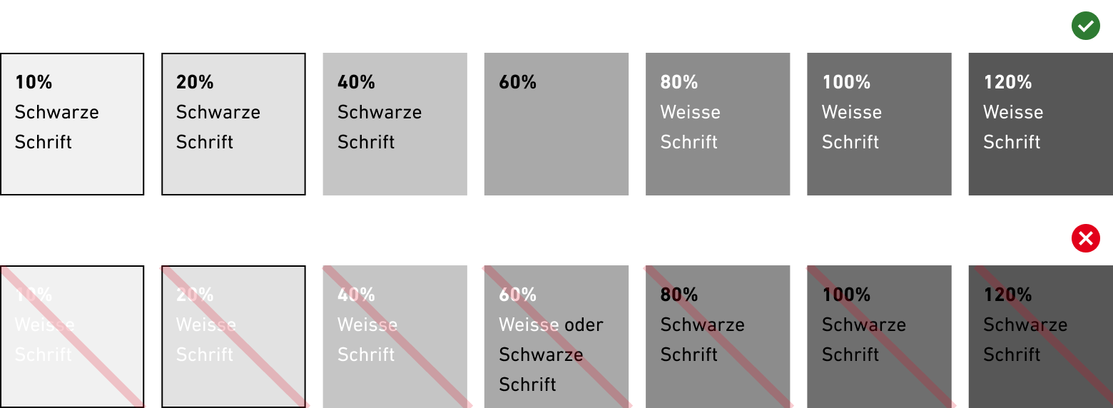
Ensure sufficient contrast
Surfaces with 10%, 20% and 40% colour shades always have black lettering (accessibility). It is better not to use any text on 60%. From 80% we use white lettering.
Contrasts for digital applications can be verified using programmes on the Internet (example: external pageContrast Checker).


Contact